
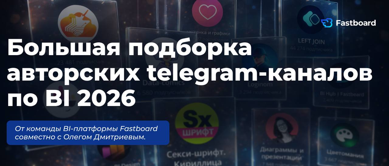
Big collection of original Telegram channels on BI 2026 💪
There is more content about analytics than data itself 🤷♀️
Some analyze trends and dashboards, others teach visual storytelling, and some joke about SQL — but truly useful content is always less than it seems.
My team at Fastboard and I have selected channels that we read ourselves and recommend: they help you think like a product, improve visualization, and create analytics that works, not just looks pretty. Below is our proven selection 👇
📱Analytics and BI
🔘Rock Your Data — a channel about data engineering, careers in analytics and Data Science in the Western market, as well as modern cloud technologies. Lots of useful breakdowns of dashboards, metrics, and analytical approaches.
🔘Nastenka and Graphs — a channel about dataviz, dashboard design, Tableau, and data visualization for business.
🔘Data-comics — a channel about dataviz comics, data art, and funny/interesting data visualizations. Useful not only for mood but also for understanding how visual metaphor works.
🔘Power BI Design — a channel by Fastboard technical expert Maria Girda. Practical tips on design and UX to make your dashboards not only informative but also intuitive.
🔘LEFT JOIN — clear explanations about data analysis, technology, neural networks, and of course SQL.
🔘Data Zen — simple words about the work of an analyst, and thinking through problem-solving rather than tools.
🔘BI Hub | Fastboard — a lively channel for BI practitioners. Besides case studies and updates of the domestic BI platform Fastboard, there are dashboard battles and webinars where you can learn from the experience of the development team and industry colleagues.
🔘Loginom – a channel from the developers of the Loginom platform: ETL practices, visualization, working with metrics and data models.
📱Design and Visualization
🔘Sexy Font. Cyrillic — for those tired of browsing Latin fonts. 1000+ FREE fonts. Not gonna lie, we often peek here for infographic ideas, beautiful fonts, and visual solutions for dashboards, reports, and presentations.
🔘Colormania — color schemes, examples of successful palettes, and tips on color selection — a must-have for anyone working with visualization.
🔘Charts and Presentations — "PP recipes" and basic principles for building understandable charts and graphs.
🔘Reveal the Data — Roma Bunin's channel about data visualization, dashboards, and BI system development. Example breakdowns, visual cases where infographics really help understand complex things.
🔘Get the Sources! — a channel we visit for beautiful dashboard design sources. An excellent source of structural and visual ideas for data interfaces.
Read regularly, repeat the best techniques, build a library of examples, and look not only at aesthetics but also at meaning.
If you know cool channels we missed — write in the comments 👇
@data_dzen🙂
Comments
0No comments yet.
Sign in to join the discussion.