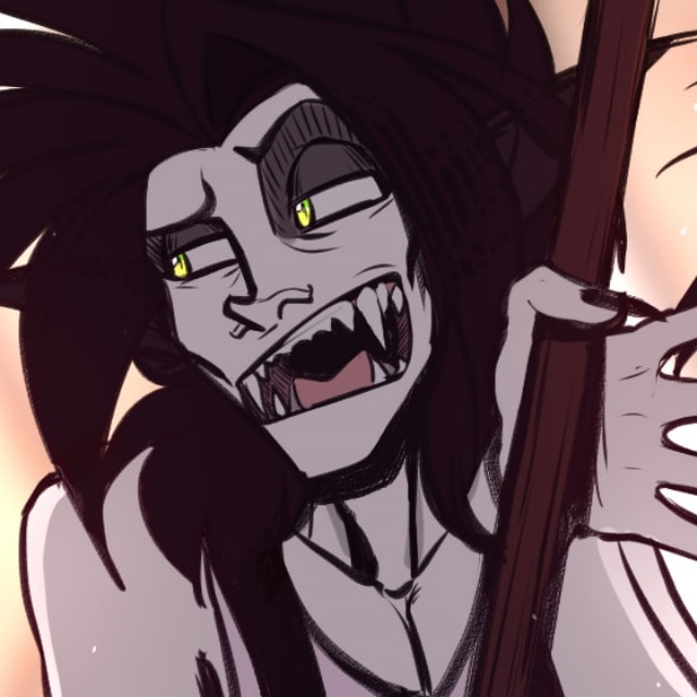

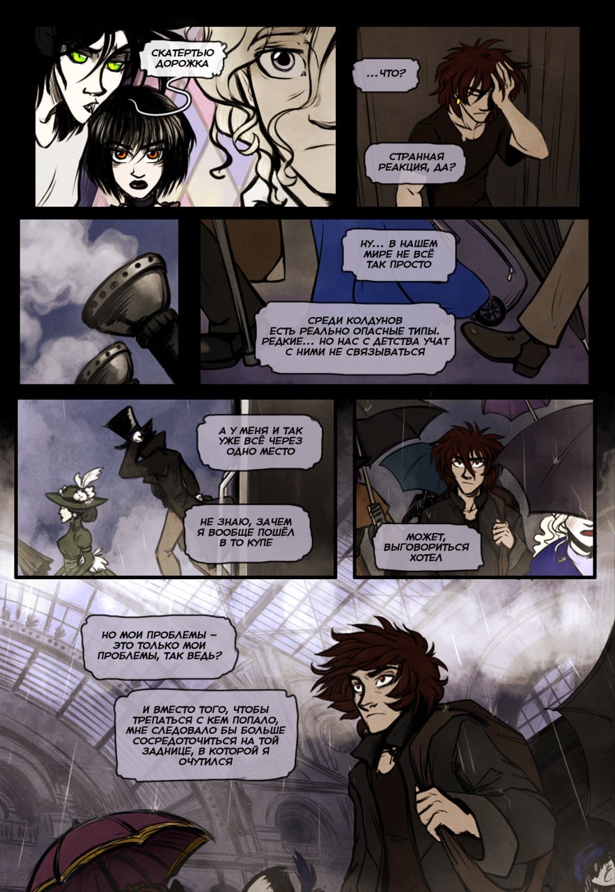
In between, I continue improving the old pages of the Wizards.
I always thought their biggest problem was the outdated, wonky drawing, but no, it's not just that 🤣 Sooo much text, it's sooo literary, and the bubbles are always out of sync, so you don't know which order to read them in... Also, they often go out of frame, which again creates confusion as to which moment a bubble belongs to. And the picture is sometimes heavily covered.
At the same time, I can't really fix it much! Even by mercilessly cutting, splitting, reworking, I still can't reduce the amount of text to an acceptable level, and the page is still cluttered, and the drawing is partially covered. Plus, the old pages have a slightly different format, not very suitable for printing, so I'm reworking that too, sometimes even adding or moving things. In short, it's a complex process. But I'm still more satisfied with the result than not 😄 It's not perfect, but it doesn't make it worse (I hope).
At least, I like the eye flow a bit more now (how the gaze glides across the page following the text). What about you?
On VK Donut, I'll post a more detailed comparison of old and new pages a bit later.
Komentar
0Belum ada komentar.
Masuk untuk ikut berdiskusi.