
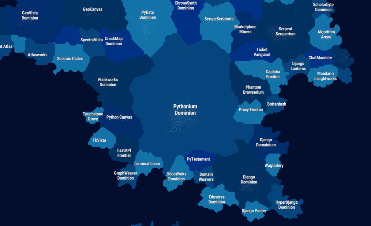
🗺 GitHub Graph Visualization
Check out this beauty — 690k repositories on one map 🤩
How it works:
It is based on an analysis of 500 million stars (BigQuery event data 2011–2025).
1. Links: The Jaccard Similarity Index is calculated. If users often star FastAPI and Pydantic together, the distance between points decreases.
2. Clustering: The Leiden algorithm is used. It splits the graph into 1500+ clusters.
3. Naming: The names of the "countries" were generated by an LLM based on an analysis of the cluster contents.
Browse through the various Python Dominions, maybe you'll even find your own project 🌝
#just_for_fun
Comments
0No comments yet.
Sign in to join the discussion.