
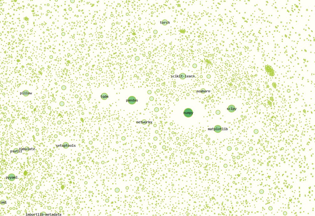
The official PyPI repository has long turned into a dump where everything is thrown in: from production-ready frameworks to Among Us cheats and schoolchildren's test packages.
One enthusiast took the trouble to visualize this entire ecosystem as a graph.
How it was done technically:
1️⃣ Metadata of all packages was exported via BigQuery.
2️⃣ The dataset was then run through filters. Obvious junk without filled fields and packages with fewer than two dependencies were thrown out. About 100,000 nodes remained.
3️⃣ Everything was rendered using the Force Atlas 2 energy minimization algorithm (a force-directed graph layout algorithm).
What the visualization showed:
▫️ Semantic clusters. Packages don't hang in a vacuum. Around
numpy, scikit-learn, seaborn, and tensorflow predictably cluster. There are clearly defined zones for cryptography or web development.▫️ Anomalies and copy-paste. The graph perfectly highlights junk. Entire clusters of packages generated from a single template were found (e.g., hundreds of variations of
python-smshub-org). An ideal tool for automatic malware detection.▫️ Corporate monopolies. Vendor lock-in is easy to assess visually. Large "corporate nests" are visible: Odoo (over 3000 child packages), Triton (>300), Airbyte (320), PyObjC (167), etc.
Project code here 👈🏻
Comments
0No comments yet.
Sign in to join the discussion.