
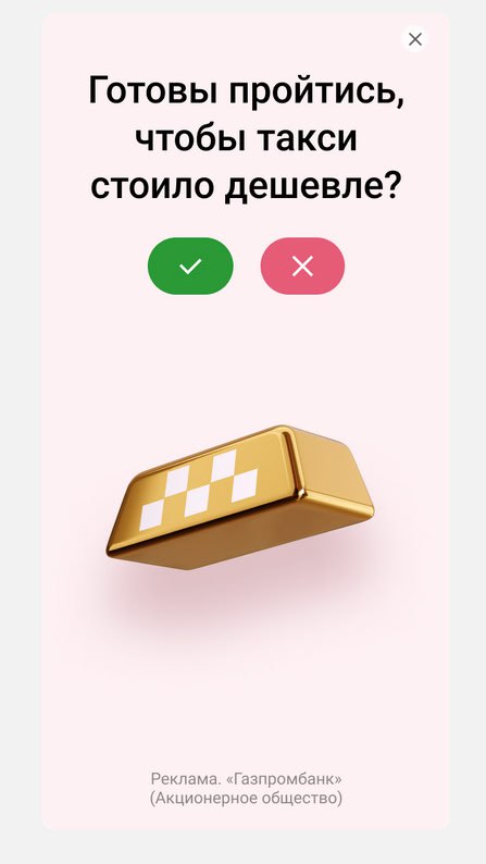

🧐 Curious format or What should advertising be like?
Usually I cringe at the ads I see on websites, but now I got interested in the special promo banner from Gazprombank, which they placed on VC
What is done well here:
1. A pleasant-to-the-eye banner that doesn't twitch or annoy.
2. Arouses curiosity. It's clear that it's an ad, it's clear that these are not buttons, but just a picture with a link. But what do they have there? You have to click!
3. The presentation is not annoying, it is integrated into the narrative within the test.
In the middle, they naturally mention offers, at the end they directly call to action.
4. Added a bit of humor.
A reference for the collection of excellent approaches to promotion through banners. It's not hard to copy.
Comments
0No comments yet.
Sign in to join the discussion.