
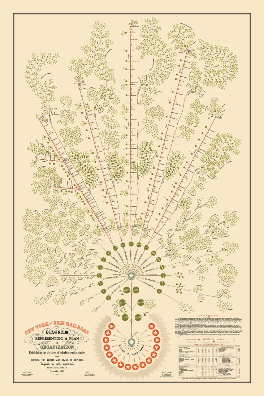
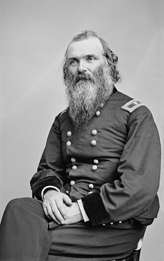
I found an amazing artifact — the original of one of the first organizational charts in history (view in detail). It was created by Daniel McCallum in 1855 when he headed the New York and Erie Railroad. Later, in 1862, his experience was scaled to all US railroads.
In those years, railroads were the most complex business in human history. Thousands of employees, hundreds of miles of track, and constant accidents required a new approach. McCallum realized: to manage such a behemoth, you need to visualize hierarchy and information flows.
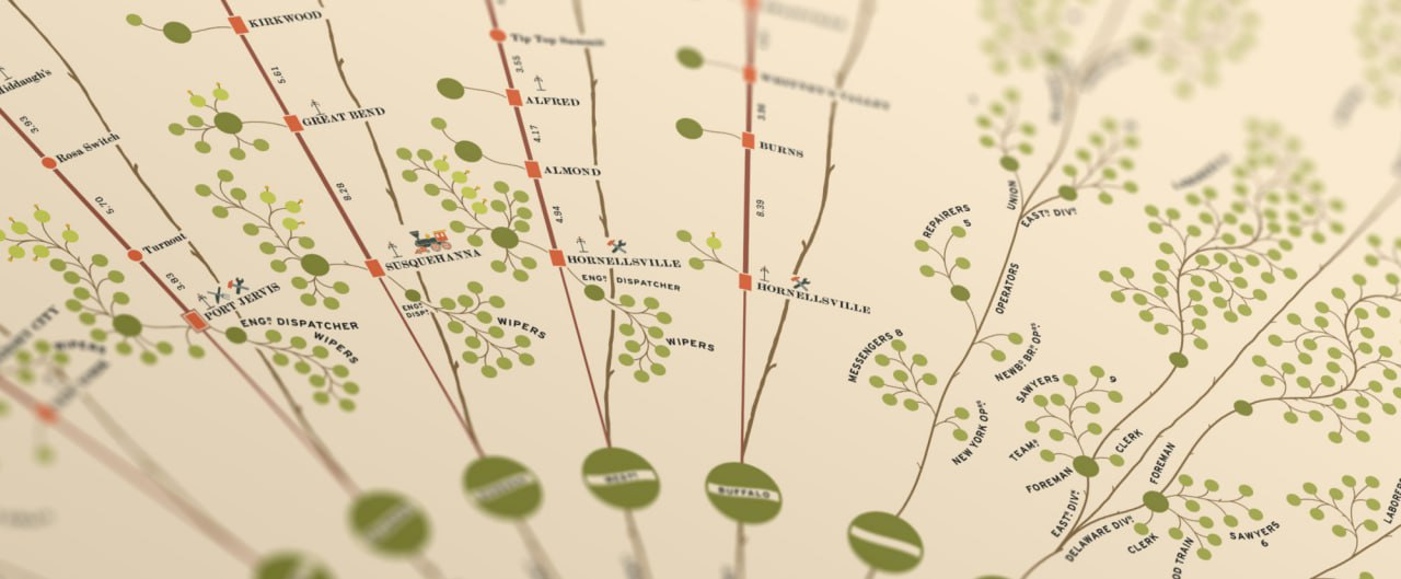
It was far from modern strict squares and more resembled a botanical illustration. At the very bottom, in the roots, were the President and the Board of Directors. This was a deep metaphor: McCallum believed that management is the foundation that nourishes the entire system, not the top that presses down on it. The chart worked simultaneously as an organizational structure and a map. Branches — divisions: Each major branch corresponded to one of the five operating divisions of the railroad. At the tips of the branches (in the "leaves") were cashiers, conductors, station masters, and workers. Another uniqueness was that the chart was tied to geography: you could see both the management structure and the geographical location at the same time.
Interesting fact: Despite its effectiveness, this method was ahead of its time and was forgotten for almost half a century. Organizational charts became widespread only in the early 20th century, when they were "rediscovered" by efficiency consultants.
McCallum also introduced another innovation: a system of daily reports via telegraph. This allowed him to see the state of the entire railroad every morning, compare plan with actuals, and make quick decisions. Essentially, the first "dashboard" in history.
MAX | VK | DZEN | TG | #management #history #business #structure #data #management #history
Comments
0No comments yet.